


|
Artist's Notes: I drove from Hamilton Ontario to Pittsburgh to be an extra at Heinz Stadium for ONE DAY! - and made it into the trailer (holding the ROGUES signs) would be a DREAM to go to the premiere :D !!!! Current Rating: 9.5 with 648 Votes |
User Comments
- the other posters dont follow a movie poster format, or are just slightly edited pictures taken from else where online, this one is original, follows the move poster format, and isnt tacky.
Wednesday, June 27, 2012 1:01:59 PM
- this one is cool because it took a different approach than most of the competition
I see why it's in the lead
Wednesday, June 27, 2012 10:38:17 AM
- Very classy
Wednesday, June 27, 2012 10:34:39 AM
- I don't think quality = complexity.
It's a simple design with strong, eye-drawing contrast.
Most of the best advertisements work because of their simplicity. It's a pretty big leap to say "no effort".
Some people don't know what they're talking about.
Wednesday, June 27, 2012 10:27:47 AM
- the night is darkest just before the dawn
Wednesday, June 27, 2012 10:15:06 AM
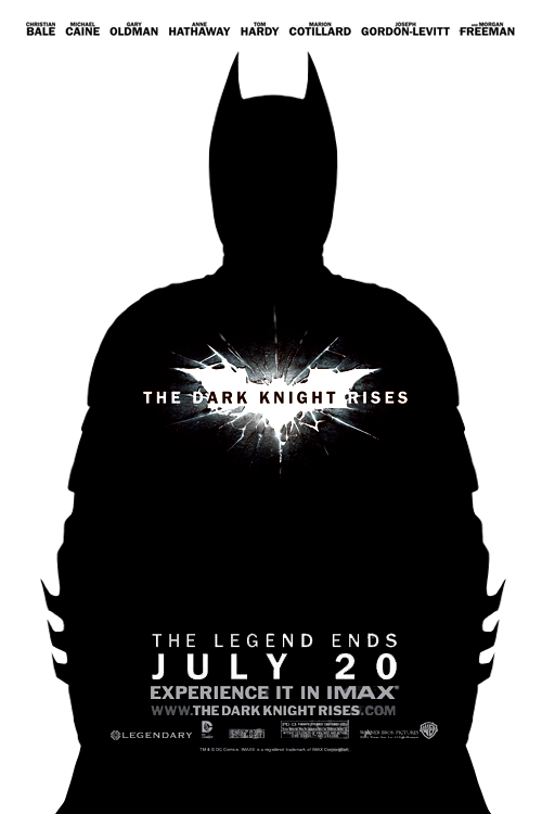
- batman is blacked out in darkness and background completely white as if it is bright giving the idea that he is rising not to mention the cracked chest showing he is broken in this film this poster tells a better story than most think
Wednesday, June 27, 2012 10:12:02 AM
- Hahaha these comments kill me. So many people don't know what good art is. Look up minimalism my friends. It is something far beyond cutting and pasting movie stills and screen caps.
Wednesday, June 27, 2012 10:05:17 AM
- The artist who did this poster has not only been a Batman fan for over 20 years (literally since seeing Batman '89 at age 2) but he is also a passionate artist, with an B.A. in Fine Arts and he has published his own comic book. So there is a hell of a lot of passion and talent behind this poster...to the "Shania Twain" reference, let's see what your artwork looks like.
Wednesday, June 27, 2012 9:00:08 AM
- Classic Mr.Brainwash, putting no effort into his artwork and getting more praise than actual creative artists. It's a cute story but as the great Shania Twain once said, "That don't impress a me much." Checkout the other posters if you want to see something better than this junk.
Tuesday, June 26, 2012 11:12:02 PM
- this is pretty good and i think it is a poster for a movie
Tuesday, June 26, 2012 5:48:15 PM